

Monitor Calibration – Getting colors correct
In this blog piece I spew about getting good color by calibrating your monitor and cough up some words on a few of my monitors:
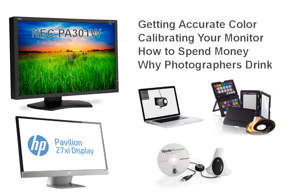
- Professional NEC PA301W, 30”, 2560 x 1600 pixels, $2000.00 (wow! you need this!)
- HP 27XI, 27”, 1080×1920 pixels, $270 (good, inexpensive, no frills)
- Old, and now deceased Gateway FPD2485W, 24”, 1920 x 1200, $700 in 2007 (RIP)
Seeing Colors – Are you sure blue is blue?
OK, you smell Junior from across the room with a full load in the dumper and a runny, chunky mess on his lip. What do you do? Well, you go grab your camera and take a few pictures of course! How cute. Rosy cheeks, sparkling blue eyes, just-perfect-blond curly hair, steamy something-or-other visibly hanging in the air, and oh that multi-colored mess on his lip…. just beautiful! Twenty five years from now, he is going to thank you, thank you, thank you, for keeping this precious moment locked into digital history forever.
So you pull the winning photograph up on your computer and find something is just wrong. The multi-colored rainbow on his lip is just not right. The rosy cheeks are… kinda purple and well…. something is just wrong with the color. Not bad, but not correct either. The problem is most likely your monitor. Your monitor is not rendering color properly. But there are other issues too…. read on.
Three Things Required for Accurate Color
Note that I wrote “Accurate” and not “Great”. We all love colors that are vibrant and loud, but when you process your photos, you need accuracy to do good work. If you want colors that pop off a page or run down a lip, you can make this happen with software like Light Room but you must start by seeing color accurately. Then you juice it up.
I will try and keep this simple but getting accurate color is a pursuit that has no end. Professionals in the graphic arts, photographers, and particularly in the medical imaging field, will pay tens of thousands of dollars for an accurate monitor. Professionals go through great pains to see and print accurate color. There is some good news for us mortals in that you can get way better color by understanding what is ruining it before you spend money to correct it. The three big reasons your picture color is off are the following: 1) Your monitor is inaccurate, 2) Your camera didn’t interpret the color in your scene correctly, and 3) Your camera juiced the colors.
You can get 90% of the way to accurate color by following my recommendations here in order of importance:
- Calibrate your monitor. I find virtually all consumer monitors are just wrong at producing accurate color. They are not built to be accurate, they are built to sell and consumers want a monitor that pops and shouts from a crowded store display. You really, really should calibrate your monitor.
- Shoot a grey card or color card. At your shooting location, take a picture of a grey card or color swatch panel to capture local lighting information and adjust color later in software. I do this at virtually all my shoots particularly when taking pics of people to obtain accurate skin color.
- Use a color-accurate picture style or picture control profile in your camera or PC software. All camera manufacturers have a setting in their cameras for color accuracy and it is not the default setting. Surprised? Camera companies have to compete with each other too and they want their pictures to PoP so accuracy is the cost. Set you camera to the “accurate” setting if you shoot JPGs or set it in software later if you shoot RAW and do this before you start your tweaking. Your manual will tell you what this setting is called in your camera.
This blog piece is about monitors and how important it is to calibrate them. For the other stuff see my other blog pieces:
- Shoot a grey card or color card Click here for backyard bird and getting accurate color.
- Use a color accurate picture style or picture control profile. Stay tuned as I am writing another blog piece on this important item
Calibrate your monitor
I recommend buying a calibration tool like a Color Munki or Spyder (read on….), but there are other ways you can play around with calibration. Here are a few:
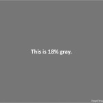
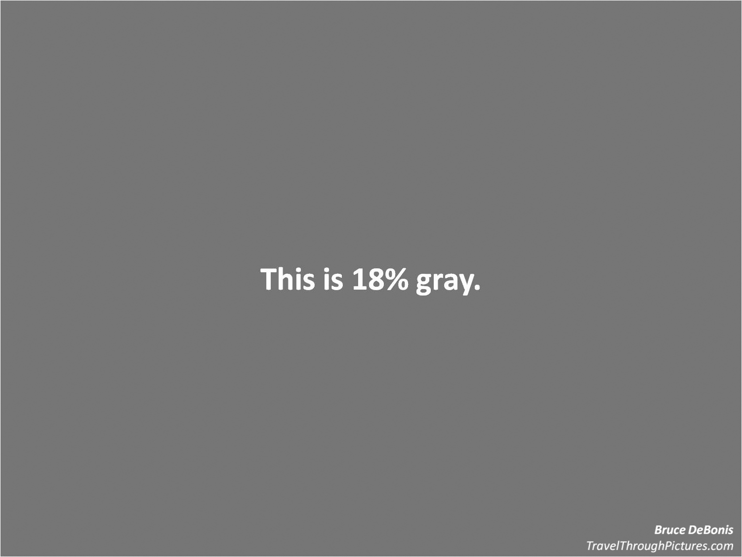
1 – Use the controls on you monitor and “eyeball” it. I don’t recommend this at all except for adjusting color with a gray card. So, if you did tweak these controls, find the menu item in there and reset it to the factory settings before you continue. But you can do a quick test of color if you have a gray card: set your monitor background to R=118, G=118, B=118 as this will approximately yield the 18% gray of a photo gray card. Then, just hold up your gray card to the monitor and…. well you will see. Just do this with daylight illuminating your gray card as artificial lighting will tint the color of your gray card and make you crazy. If you don’t know how to set your background to gray, just click here for my own 18% gray artwork (it is just genius!). Another source for calibration, particularly for gray scale and brightness, is the ‘net. There are ton of good resources out there and I am not going to re-invent the wheel here. Go searchin’!
2 – Use Windows 7 built-in calibrator. This is better than nothing, but again, I don’t recommend it. Go ahead and give it a try. It will create a color profile file that will be loaded whenever you boot and you can always delete it or it will be overridden when you do it again with a better tool. To use the tool, right click on your desktop, click “Personalize”, click “Display” in the left column, click “Calibrate color” in the left column, and follow the instructions. This tool is not that good but better than nothing.
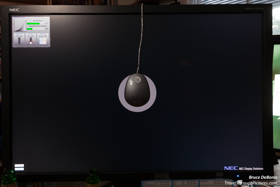
3 – Use a Color Munki or Spyder tool and calibrate your monitor properly. I’ve owned both of these tools at one time or another and they work… for the most part. You pay some money, get a piece of software and a cool device you hang on your monitor. Push a button and ……. oooooo….ahhhhh….. stuff flashes…. you guzzle a beer ……. and then viola! You now own your very own, calibrated monitor. These tools create a profile that is loaded every time you boot your computer. You will see that each of these popular tools have many options and models but I recommend you get the cheapest they offer. They will be under $100.00.
Now I noted above that these calibration tools like Color Munki or Spyder work for the most part…. but they are not perfect. The reasons for this are many and very complex, but I will sum it up for you here: if you have a plain consumer monitor, it will never be perfect. You may be really proud of your super bright 27” new monitor with USB ports and all kinds of inputs and outputs, but unless you paid well over $1,000 for it, it does not have the internal adjustments to be a perfect monitor. Just doesn’t. You will have some adjustments by hand. Don’t worry, it is not too difficult. This does not mean you shouldn’t bother calibrating it, no, you must calibrate! But if you want it really really correct, you gotta buy a professional monitor. Like I did.
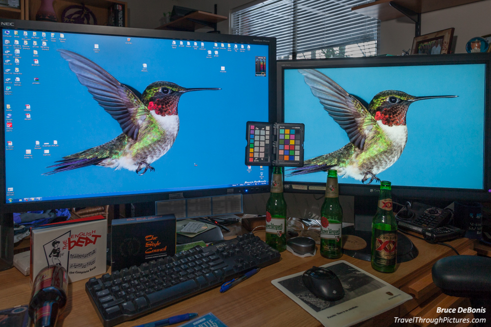
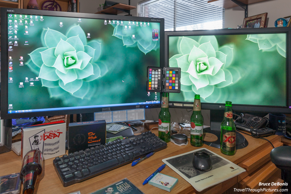
Sometimes, your monitor is just toast
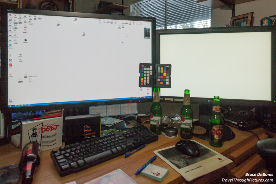
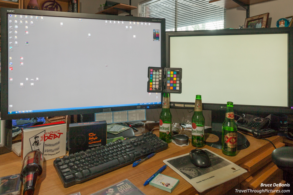
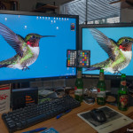
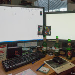
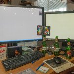
Calibrating is always a good thing and will improve any screen, but if you have a crappy, tired monitor, it just can’t be fixed. I had a Gateway FPD2485W 24-Inch display and I thought it was one of the best on the market seven years ago. It cost me something like $700 back in the day. Well, look in the picks above and you can see it looks terrible. The monitor on the left is my calibrated and professional NEC PA301W and the one on the right is the old, dying Gateway. It looks yellow and just awful and that is after I calibrated it. It didn’t always look this bad, at least I didn’t think so, but as it aged, it clearly changed and changed for the worse. Do you really know how awful your screen is?
Check out the pics in the carousel above… the monitor on the left is my new professional NEC PA301W calibrated monitor and the one on the right is my Gateway. The difference is striking. Actually a total strike out.
The NEC PA301W (PA302W)
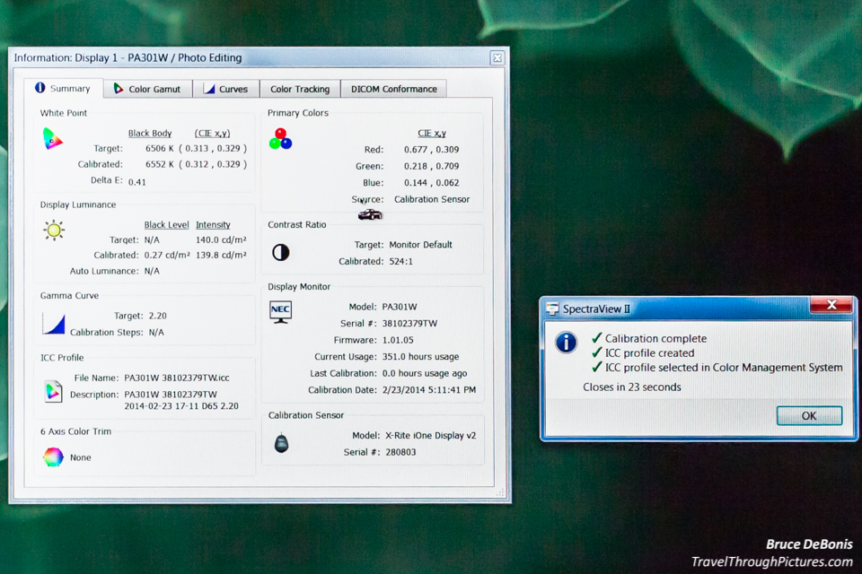
Ok, I went overboard. I just wanted a good one. This 30” pro monitor cost me about $2,000.00. It comes a bit cheaper without the NEC calibration software and calibrator, but spend the bucks and get it. For the extra bucks it comes with and X-RITE calibrator that works with the NEC software to tweak all the internal stuff that makes good color and contrast.
The resolution is 2560 x 1600 pixels and with the larger screen, I can see all the gory ugliness of my amateur photographs.
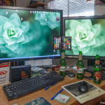
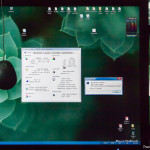
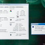
In the pics above, I show the calibration in progress (not much to see really) and the results. Just comparing the two monitors should compel you to get a calibration tool.
How much should you spend for a monitor? Try the HP 27XI for $270
Look, I get it, you don’t want to spend 2-large on a screen. So what should you buy? Well, for just less than $270, you can get a pretty darn good HP 27XI and do great photography on it. I purchase and own this monitor and it is a nice, no frills monitor great for photo editing. It is 27” wide, “HD” 1080 X 1910 monitor and the colors are good right out of the box. So, no need to calibrate right? Nope… no such luck.
This HP monitor was too red and too bright. I could see it right away as the first thing I did was set the background to R=118, G=118, and B=118, 18% gray, and could see a slight red caste. Calibration immediately turned down the red and brightness and now it is a pretty darn good monitor.

