


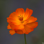
Flowers with Color Splash
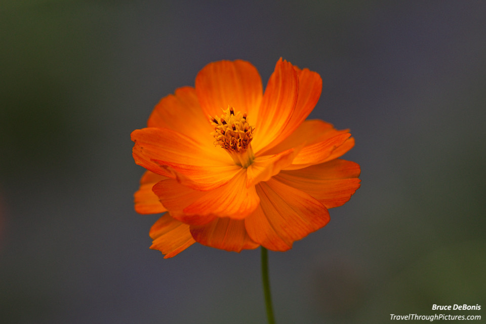
I’ve been shooting flowers again lately; something that feels great doing in the spring after a craptastic winter. I never tire of this even though I have probably thousands of shots. Needless to say, the delete key is my best friend and I am only keeping my best blossoms. Looking back over my library of pics, I find it interesting that at one time, I thought everything I snapped was worth keeping. Now, I realize most of what I shoot is crap and only worthy of the bit bin.
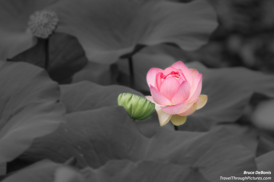
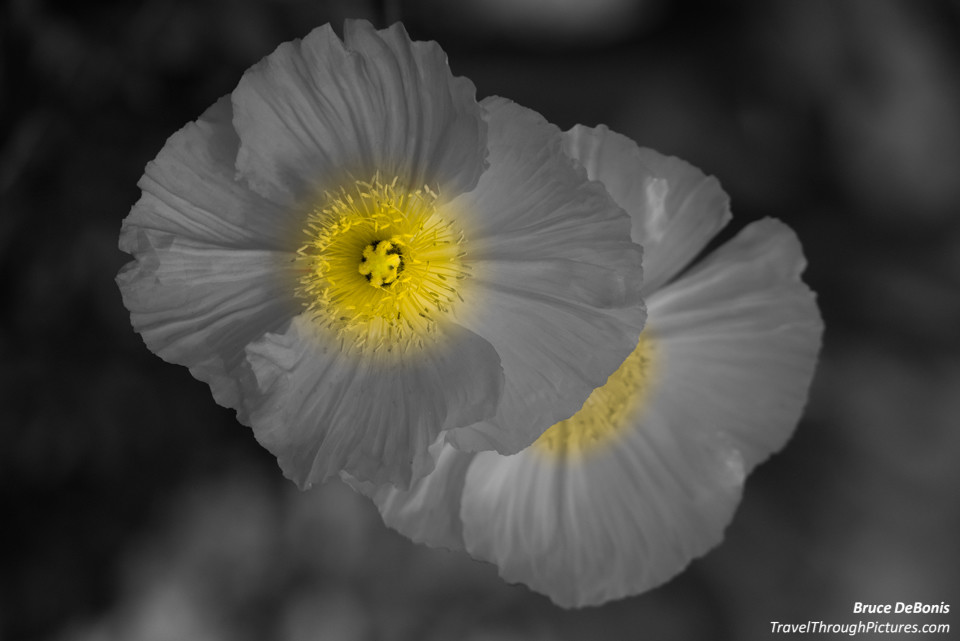
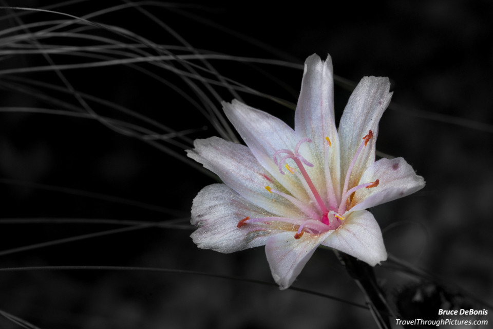
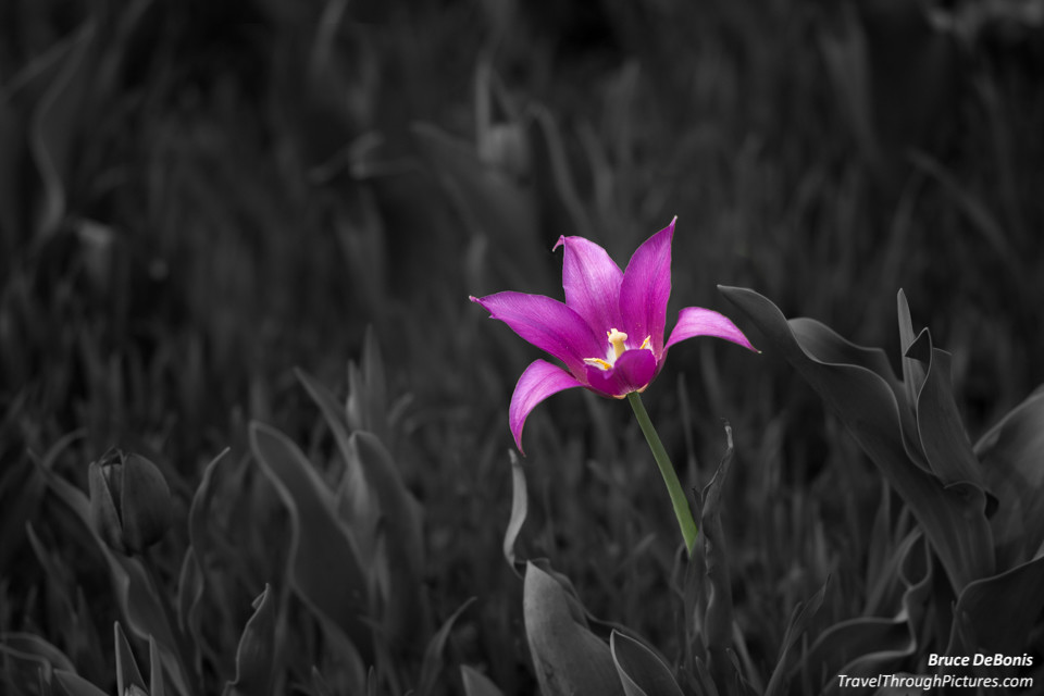
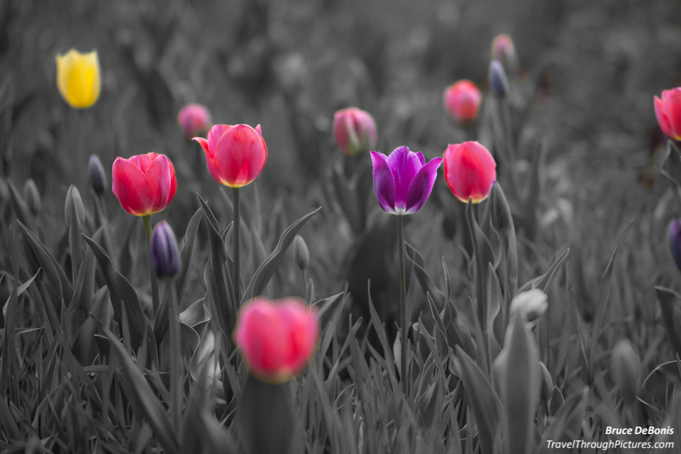
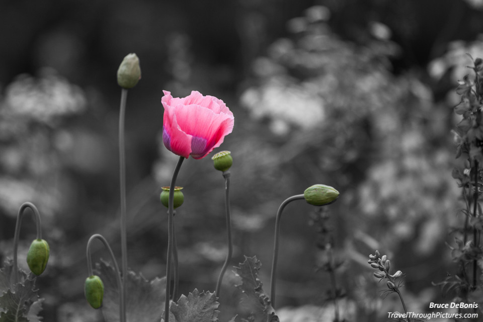
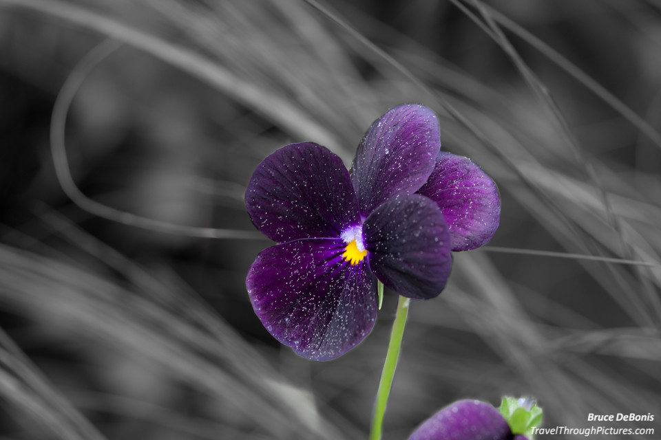
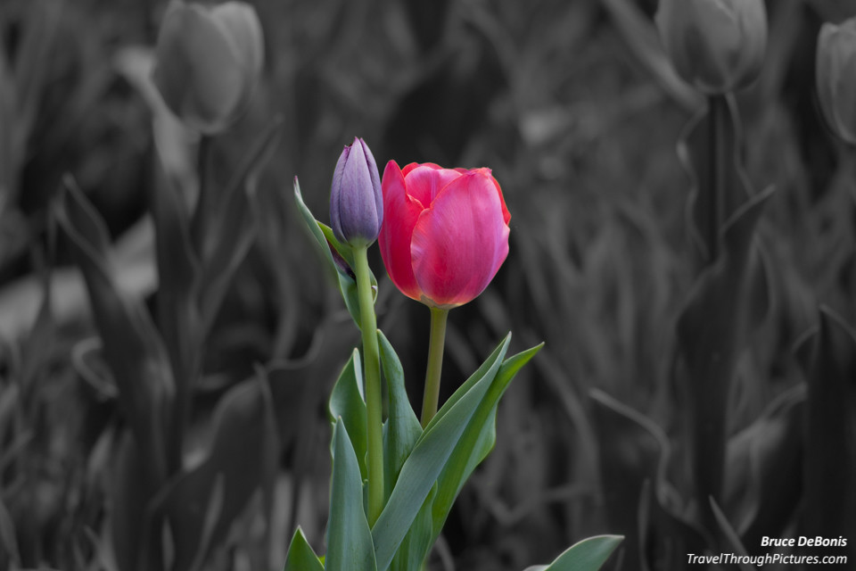
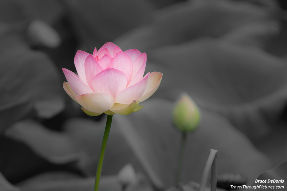
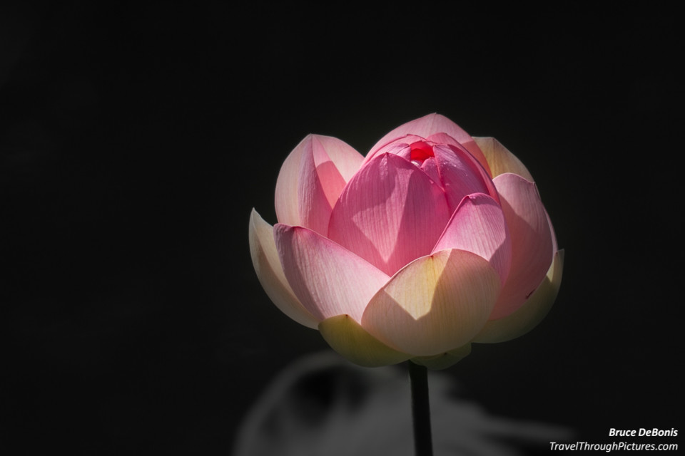
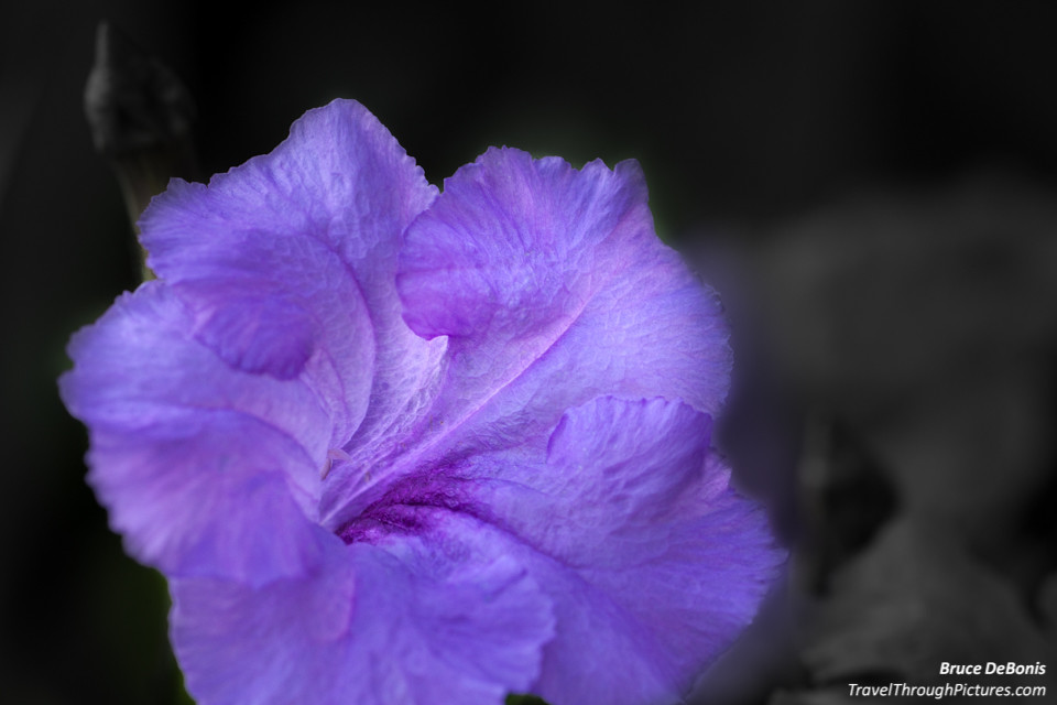
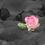
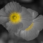
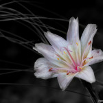
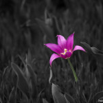
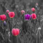
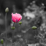
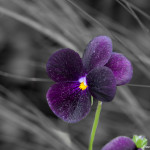
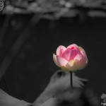
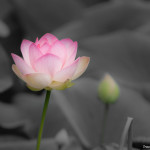
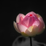
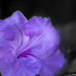
Color Splash!
What do you think of these black and white pics with a spot of color? When I first saw this color effect used in mass media around twenty years ago, I hated it as it looked unnatural and was being used to sell me something. Now with these powerful photo editing tools, I can whip one of these up in about twenty minutes and 1.5 beers…. and I think I like them. I displayed a few in the carousel above with and without this effect so you to compare and judge for yourself.
I Googled this approach to photo processing and I could not find an “official” name for the technique. I’ve seen it described as “color splash” or “color spotting” but I assume there is some academic label used in the graphic arts. If you know of it, drop me a post.
LightRoom For Splash
I used LightRoom to make these color splash photos. LightRoom is the tool I use to process all of my photos but it is not a tool for heavy photo manipulation such as adding text or layering in a sombrero on your Chihuahua. I am sure there are other tools more suited to do color splash, but with a bit of time and enough beers, LightRoom works well to make this artistic effect.
Here are the simple step-by-step instructions to make this effect:
- Crop and process your pic as you normally would do, leaving the color.
- Using the brush, paint the entire photo except what you want as color.
- Zoom to 2:1 or 3:1
- Turn on “show selected mask overlay” to see where you painted
- Paint close to the flower but don’t touch it leaving a tiny gap
- Turn on “auto mask” and now paint the edges of the flower (auto mask recognizes edges and won’t paint into the flower)
- Turn the saturation slider all the way left.
- Try turning down contrast all the way as this will take out some harshness of the gray background
- Try dropping exposure down a bit for more drama
- Start a new brush and do it again, as the saturation slider will not take out all color.
To be honest, painting takes time as the “auto mask” doesn’t work all that well and you have to magnify the pic to 3:1 and be very careful to get the flower edges correct. But, that is what the beer is for…. take your time! It is OK.
There is an alternative way but it does not leave sharp edges, and that is to use the Radial Filter. I used this for a few above where the fade between color and black & white are gradual. Just draw the Radial Filter over your flower, and the turn the saturation slider down. Everything outside the ring will now go gray. The saturation slider works better with this filter and you won’t have to do it twice.
f/2.8
To get those blurry backgrounds, I usually shoot wide open at f/2.8. This low number represents a very wide lens aperture that has the effect of narrowing focus to just an inch or so. This is called a narrow depth of field. If your lens does not open this far, that is OK, just put your camera in Aperture Priority Mode, open your aperture to its lowest number, zoom in,, move in close, and try to get your background to be far away. These tips will help you get that nice dreamy background you see used by professionals all time. Of course buying a lens that opens to f/2.8 makes this easier, but as you would expect, these lenses can become quite expensive (no surprise there!).
The Equipment:
- Canon 5D MkII
- Various lenses
- LightRoom
- Pilsner Urquell

